
Wednesday, 30 April 2014
Week 12 - Hebden Bridge, Colour in spring
Week 11 - Contemporary Architecture

This is a 20 minute conte crayon study of the national media museum. First of all, the building is not clearly defined as you cant really make out the edges of the building. The use of the white conte crayon emphasizes where the light is hitting on the building. The use of contrast and shadows create depth especially shown in the building on the right. Overall, the drawing lacks from as there is no clear perspective nor focal point to help portray the building outline and shape. Also, there is no background which doesn't help the picture as it looks as if its floating on air.
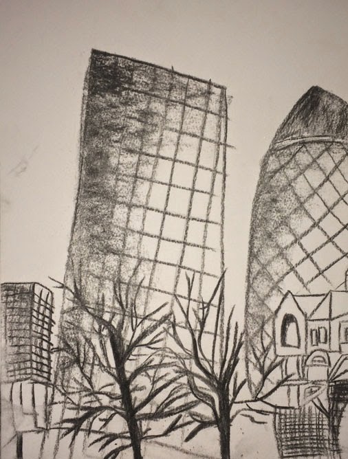
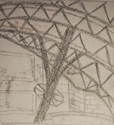
Above is a 20 minute study of the gherkin building using charcoal on a visit to London during the holidays. The drawing shows the view of the building next to the gherkin as well as buildings in the foreground and background. This creates depth and creates more harmony within the picture. This drawing could have benefited from using a different medium; because the study was drawn at night there was lots of lights coming from the buildings so maybe if coloured chalk pastels were used it would have created a more effective and pleasing study. It also would have helped to identify the windows more clearly. The vantage point was taken from the bottom looking up however you can't tell as much in this study as the proportions of the two main buildings look incorrect. There are several focal points for example in the foreground the trees stand out and in the background the top darker areas where no lights were glaring on them. Overall this is a good representation of the view but could have done with some more detailing around the windows area.
Week 10 - Classical Interiors at Cartwright Hall


This first image is a study of the balcony area inside Cartwright Hall. This took approximately 15 - 20 minutes to complete. Although the drawing doesn't look as similar in real life the two pillars help create the shape and form as the depth implies that the tonal values used creates a contrast of shadow and light which in turn gives it its cylindrical effect. The drawing could have benefited from a better vantage point so that it would create more extra depth to the drawing giving it a more pleasing composition. This could have been achieved by standing further away from the pillars instead of right underneath them which would have then included a background as well as a foreground.
The second image is of the pillar connecting the archway inside of Cartwright hall. This took approximately twenty minutes to create using a graphite pencil. The pillar doesn't look accurate in terms of its proportions and form. The slight shading using the graphite pencil on the left hand side of the pillar gives the pillar a more cylindrical and 3-dimensional effect. The drawing could have benefited from being more complete and have some sort of contrast in tonal values to help show the depth of the pillar.
Week 9 - Shadow and Tonal Values Royal Armouries

The above drawing is a study of the entrance of Royal Armouries museum in Leeds. It is done using graphic marker pens and took approximately 30 minutes to complete. The drawing has a two point perspective which creates a foreshortening effect. However, the windows could do with some work as they are uneven and lack consistency as they are not similar to each other. The different light and dark tonal values used in the windows give the windows more depth and 3-d like effect.
Week 6, 7 & 8 - Landscape, Angles in Architecture, Perspective of Curves & Scenic Composition

The above is a fifteen minute study of the Richmond Building interior created using a graphite stick. The vantage point was taken from the bottom looking up while sitting not that far from it. The angles of the barriers on the left hand side are drawn accurately as they have a 90 degree angle to them and show that they go straight and then turn left. The elevator in the foreground could use some tonal values of light and dark to help create more depth and give it a 3-dimensional look. Overall the drawing lacks detail and depth to help make it look more realistic and more pleasing to the viewer.

The above is a 40 minute drawing of the field area outside of student central in university. This was drawn using a graphite stick. The drawing consists of a background, mid ground and foreground which gives the drawing its complete look. The shadows that are cast on the field of the trees indicates where the light source was coming from. The vantage point was taken from a flight of stairs slightly higher than the field area to be able to get a better composition. There are several focal points such as the darker areas on the tree trunks as well as the shadows which are cast on the bumpy field. The angles of the roofs on the buildings on the right portray which point of view the drawing is drawn from. This drawing could benefit from some colour or maybe a different medium to make it look more pleasing to the eye. Overall this is a good drawing which is drawn quite accurately and has a good composition.
The two drawings below show the interior of the atrium in the Richmond building. Both drawings were done using a graphite stick and took approximately 20 minutes each to complete. Both drawings include the dome of the atrium to portray the perspective of curves. The vantage point was taken from the second floor of the atrium so it was as if you was looking downwards with the horizon line being straight ahead. Both drawings include some depth and are more focused on the pipes which support the plastic dome rather than the dome itself. The drawing on the right consists of foreshortening with the doors at the bottom being more slimmer and smaller. There are several focal points in both pictures especially the shaded areas of the pipes which give them more depth and a realistic look 3-dimensional effect. However the drawing could benefit from some more detail especially in the backgrounds as the drawings seem to be more focused on the pipes.

Week 5 - Non - Human Anatomy

The above drawing is of a squirrel using a graphite pencil, and took approximately 5 - 10 minutes to do. It was done during a visit to the taxidermy museum in Leeds. The proportions of the body are quite accurate however it could benefit from some more detail such as including light and dark tonal values to create some contrast and depth to help it look more true to life as well as 3-dimensional. It could also benefit from a background or maybe some shading around the actual sketch to help emphasize the squirrel and the wooden stick it was sitting on. To help it look more realistic if another medium was used such as pastels or conte crayons it would make it more pleasing to the viewer.

The above is a study of one of the butterflies at the taxidermy museum. It was done using soft chalk pastes in 15 minutes. Firstly the colour of the butterfly was meant to be more dull and not as vibrant as the yellow shown. Also, the butterfly is not as accurate in terms of proportion as it lacks symmetry. The drawing could have benefited from a background or backdrop to help give the butterfly some depth. Also, the butterfly lacks some detail as the butterfly had a more intricate design on it's wings. There could have also been a better vantage point for example taken from the side instead of full on to make the drawing look more pleasing to the eye.

The above is a study of a sea bird in the taxidermy museum. This study was done in charcoal and took approximately 15 - 20 minutes to complete. The proportions of the body look quite accurate in terms of the head being smaller than the body. The vantage point could have been at a better place instead of straight on to make it look more appealing. Also, it could benefit from including a backdrop or just some shading around the bird to emphasize its features such as the beak and feet area.
Weeks 3 & 4 - Anatomy and Movement

The above is a series of sketches done with a charcoal where the model moved position every minute. The model is seen using a tennis racket. The proportions of the body are not accurate as they can be throughout the sequence and they don't stay consistent throughout the gestures made by the model as their were done extremely quickly because model was slowly changing into his next position. Also, the lack of detail in muscle structure and contours of the muscles make it a less appealing study. Overall, the drawing captured the gestures made by the model but it could benefit from some muscle structure and maybe some tonal values to portray where the weight and the balance of the body is.

The above is a series of sketches done in two minutes each with a graphite pencil while the model was rolling over on the floor. Anatomically speaking the proportions of the body are somewhat accurate which helped to create symmetry and consistency throughout the continual movements made by the model. Although, the drawing does lack some detail as well as tonal values which would have helped to create some depth and gave it a 3-dimensional view. The sketches lack foreshortening as it seems that their are drawn from a birds eye view which also indicates to the lack of depth and harmony created in each of the gestures made.


Subscribe to:
Comments (Atom)